Guest feature | A new Meniga: Our rebranding process
We here at Meniga design solutions that help people understand and manage their money. A little over a year ago we decided that we wanted to take a fresh look at our products. Improve on what we had already built, leaving no stone unturned.
Now we are finally seeing the light at the end of the tunnel and plan to release our new product later this year. As a part of this work we improved our brand and visual language. We asked ourselves what are we really trying to achieve? Who are we trying to help? What is the point of all our work? Let‘s take a step back and start at the beginning.
Our old logo (Source: Meniga)
After spending some time looking at the current products and brand we discovered that we had to strengthen our values and mission as a company. The reason being that we needed a stronger vision to move forward to build a great products. Working with the rest of the company we set out to define our values and mission.
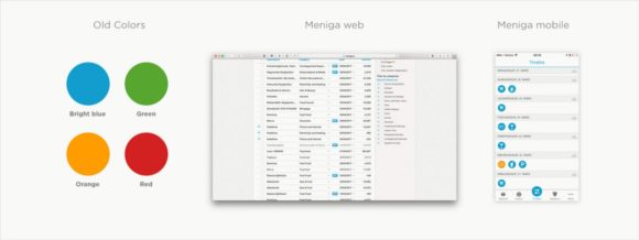
We used the great design work we had already prepared and took it to the next level (Source: Meniga)
After great feedback from our teams and many brainstorming sessions we found out that we want to build products that are personal, simple, honest and help people see their finances in a fun and interesting way. Having defined our values and mission the rest of the journey became a lot easier.
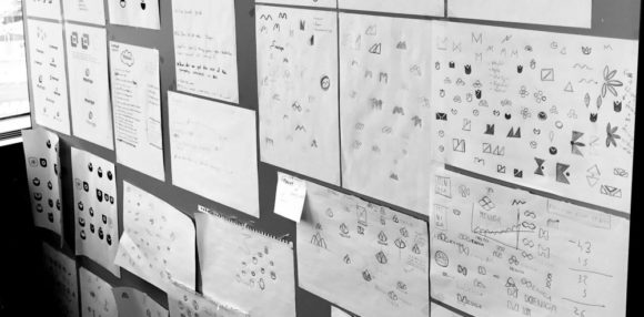
We used our design space to hang up our logo ideas for people to see (Source: Meniga)
New logo
As part of the process we started looking at our logo. It’s important that a logo is unique, functional in different mediums and represents the company in a meaningful way. Keeping these criterias in mind we didn’t think our previous logo ticked all these boxes. So, we started sketching out ideas that we thought would serve our new direction better.
After long design sessions and self-reflection, we finally landed on a symbol that we all agreed would work much better. Without further ado, we present the new Meniga logo. Let me tell you how we arrived at this symbol.

(Source: Meniga)
The new logo is a symbol that we feel captures the essence of what Meniga does but is also simple, easy to use in different medium and represents our company in a meaningful way.
(Source: Meniga)
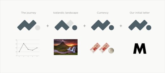
The mark reminds us of a graph that goes up, down, and up again. Just like people finances and the journey of life. It hints at the beautiful Icelandic sunset and mountains, paying homage to the country where the company was founded. We liked that it has a circle that represents the coin, which is a big part of our financial lives, and finally it’s an abstract version of Meniga’s capital letter M. Bring it all together and we have the new Meniga logo. From today onwards we are proud to say that we will be using our new logo to represent the company internally and externally.

(Source: Meniga)
Logo usage
We have already began working with the logo within our brand and marketing material. We just wanted to show you some of the ideas that we had, some have already been implemented but some will be made later.

Working with our abstract pattern and logo together (Source: Meniga)
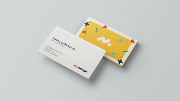
Business cards that are currently at the printers (Source: Meniga)

Exploring how to work with the shapes and logo on apparel (Source: Meniga)
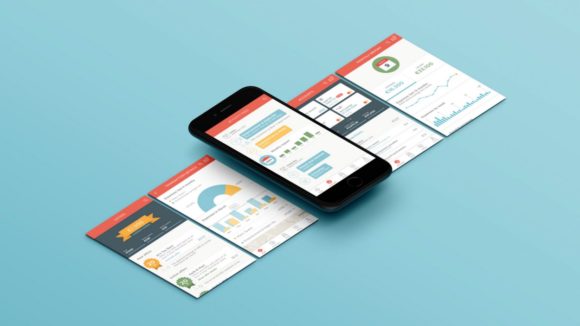
Since we are a tech company it’s important that the logo works equally as well on screen as it does on print. So here are some examples of how it looks within our mobile and web platforms.
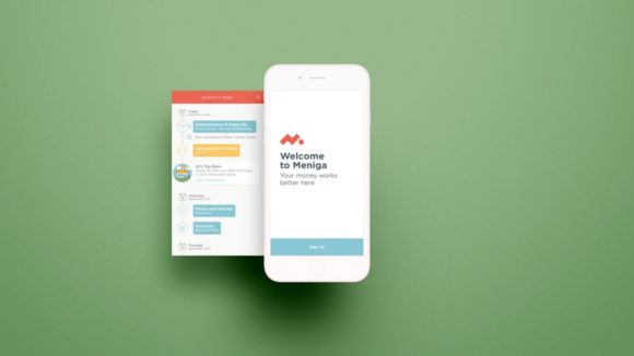
New logo on the sign up screen (Source: Meniga)
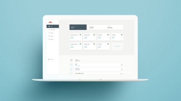
New logo with the navigation bar (Source: Meniga)
Abstract shapes
We wanted to create a visual language that we could use to help define our marketing material. The idea here is to use pluses, minuses, pie charts and more data visualisations forms in an abstract and playful way. This ties nicely into our initial idea of seeing finances in a new and interesting light. Below you can see examples of how this will look and feel like.

We are using different back designs for the business cards (Source: Meniga)
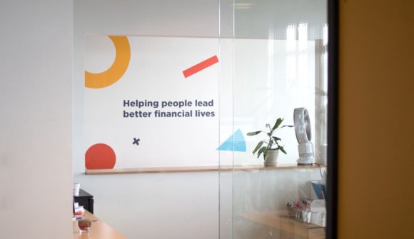
Our mission statement on one of the walls in the office (Source: Meniga)
Icons and illustrations
In our old products we found that the screens could sometimes get a little generic since we didn’t have a lot of visual elements to play around with. We came up with a few ways to enhance the experience and make the User Interface more delightful. One of those ways is to use illustrations to illustrate a concept.

Some illustrations for our user events (Source: Meniga)
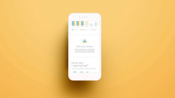
We use these illustrations within the products to help explain something we call user events. User events can be anything from fun facts, advice, insights or card-linked offers that’s relevant to your financial life. You can see some examples of them below. These illustrations help us to make the message more visually interesting and noticeable while scrolling through the screen.
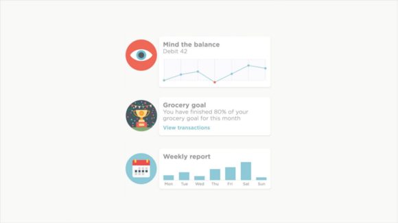
User events as they look withing our activity feed (Source: Meniga)
Icons
We use icons to help visualise in which category people are spending. It helps to identify which category they are spending their hard-earned money. We went for a more smooth and simpler icon set than we had before which fits better to our new overall look and feel.
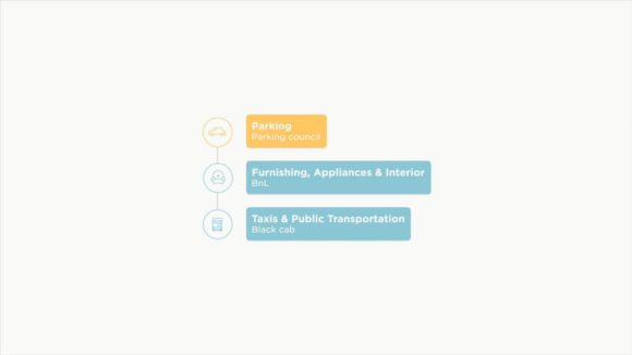
These are transactions grouped by categories (Source: Meniga)
And below you can see how the icons and user event illustrations together help make the activity feed more friendly and alive.
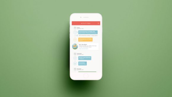
(Source: Meniga)
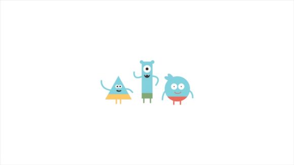
The Menigans
These guys are Meniga experts. They live inside the products and are there to point out interesting things and tell you about how you are doing financially. They are a part of the visual language that we use within the apps and help us tie everything together and make it our own.
(Source: Meniga)
They help make the apps a friendlier place and take the seriousness a bit to the next level of awesomeness. Below you can see how they appear within the app.
(Source: Meniga)
The big picture
We think that these elements are a great foundation for us to create products that fits with our new values and mission. It’s a cohesive visual language that we are excited to work with in the future.
(Source: Meniga)
We sincerely hope people will learn a bit about their finances using our products (and even have fun doing so) and in the end, we can help people lead better financial lives and improve their standard of living.
About the author:
 Jónas Valtýsson, Head of Design at Meniga: Jónas is the design director at Meniga where he oversees the design team responsible for the design work and art direction of Meniga. Jónas has extensive experience in working with brand identities, having previously worked at design agencies both here in Iceland and in the UK for over 10 years.
About Meniga:
As a CODE_n CONTEST Alumnus, Meniga is a member of the CODE_n community since the participation in the startup contest in 2012. Meniga is transforming the way banks and advertisers use transaction data. They do this by helping people becoming smarter consumers with great products. With their current implementations worldwide they are already serving +50 million consumers.
This article was first published on the Meniga blog. CODE_n is always eager to keep our readers up to date and spread valuable news, updates and trends of our community members. If you have interesting content to share, simply reach out to us.


Comments